Transforming raw data into visual representations, such as pie charts and graphs, can accelerate your decision-making process.
The Power of Visual Data
When data is presented as a simple table, making swift, informed decisions can be challenging. However, when that same data is transformed into a visual format—such as a pie chart—it becomes much easier to quickly identify trends and focus on important segments. For instance, consider a dataset where approximately 40% of customers are “Very Satisfied.” A pie chart representation helps determine which customer segment to target. Instead of expending resources on the mere 5% who are “Very Dissatisfied,” focusing on the “Somewhat Satisfied” group may yield more significant improvements in overall satisfaction.Visual Example
The image below illustrates customer satisfaction ratings with both a table and a pie chart representation. It highlights that 40% of customers are “Very Satisfied,” while 30% fall into the “Somewhat Satisfied” category.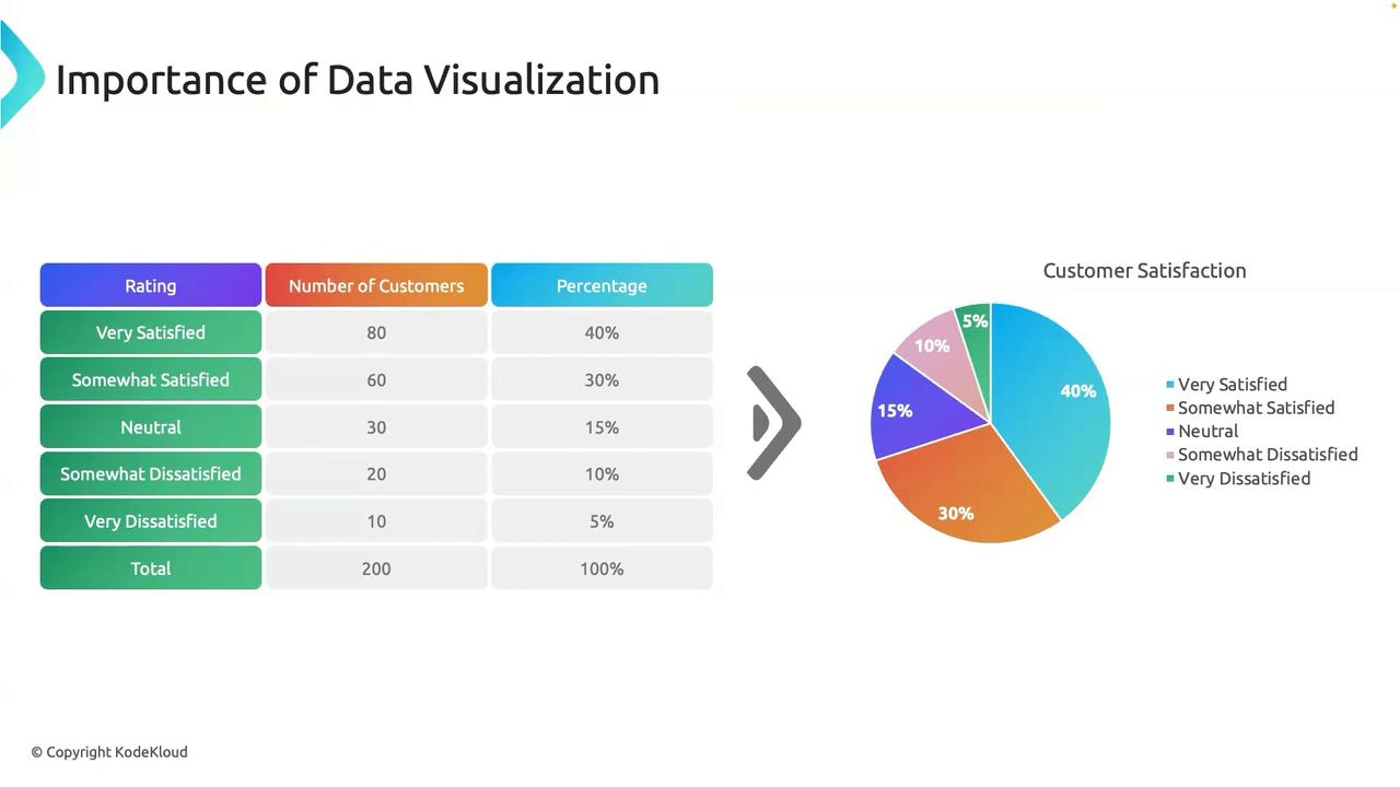
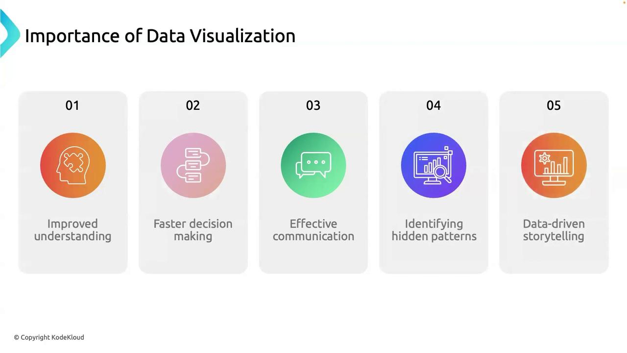
Key Benefits of Data Visualization
Data visualization offers several critical advantages that enhance the way you analyze and understand your data:-
Improved Understanding:
Visual representations simplify complex data, making it easier to observe trends, spot outliers, and detect patterns that might not be immediately apparent in raw data tables. -
Faster Decision-Making:
By presenting data visually, decision-makers can quickly understand the situation and take appropriate action. Detailed dashboards offer real-time insights to help businesses adapt rapidly to changing conditions. -
Effective Communication:
Visual tools are more effective than text alone for conveying complex ideas. They simplify presentations and help various audiences—from technical teams to stakeholders—grasp key findings quickly. -
Identification of Hidden Patterns:
Plotting data visually can uncover correlations, trends, and anomalies that traditional analysis might miss. For example, heatmaps can highlight areas of high activity that may need further investigation. -
Data-Driven Storytelling:
Integrating data with visual elements allows you to construct compelling narratives that emphasize key insights and guide strategic decision-making.